

Quartz worktops come in hundreds of colours, yet almost every kitchen decision eventually narrows down to one question: light or dark? Most advice online treats this as a styling choice, listing the same tired points about “light colours making spaces feel bigger” and “dark colours adding drama”. That advice is not wrong, but it misses what actually decides whether you love your worktop two years after installation.
The real answer depends on how you live. How much natural light your kitchen gets, whether you drink tea by the gallon, whether you have children who treat the worktop as an art table, and how much time you are genuinely willing to spend wiping surfaces down each day. Having fabricated and installed quartz kitchen worktops in thousands of UK homes, we can tell you that the customers who regret their choice almost never regret the colour itself. They regret not thinking about the practical side of that colour.
This guide covers what light and dark quartz surfaces are actually like to live with, so you can make the decision with your eyes open.
The Reality of Choosing Quartz Worktops in UK Kitchens
Quartz has become the most popular worktop material in the UK for good reason. It is engineered from around 90 to 93 percent natural quartz bound with resins and pigments, which makes it non-porous, consistent in pattern, and far more forgiving than natural stone. Unlike granite or marble, quartz does not need sealing, and spills like red wine, coffee or beetroot will not soak in.
That non-porous quality is important to understand before we talk about colour, because it changes the debate. With porous natural stone, a light surface genuinely carries a staining risk. With quartz, staining is rarely the issue. The real differences between light and dark quartz worktops come down to what shows on the surface day to day, how the colour behaves under UK lighting conditions, and how it interacts with the rest of your kitchen over a 15 to 20 year lifespan.
UK kitchens also have their own quirks. Many homes, particularly Victorian terraces and 1930s semis, have kitchens at the rear of the house with limited natural light. Large parts of the country, including Yorkshire, sit in moderately hard to hard water areas, which affects how visible limescale and water marks become. These local realities matter more than any design trend.
What Actually Matters When Comparing Light and Dark Quartz
1. What the surface shows between cleans
This is the single biggest factor, and it works in the opposite direction to what many people assume.
Dark quartz, especially in a polished finish, shows everything. Fingerprints, smears from a damp cloth, water marks, dust, flour and crumbs all stand out against a dark background. If you choose a jet black or deep charcoal quartz with a high gloss finish, expect to buff it dry after wiping rather than simply wiping and walking away. In hard water areas, dried water droplets leave pale mineral marks that are far more visible on dark surfaces than light ones.
Light quartz is more forgiving of the everyday film of life. Toast crumbs, light dust and watermarks tend to disappear into a white or cream background. What light surfaces do show is anything dark or colourful: coffee drips, soy sauce, dark chocolate, and the dreaded turmeric. Because quartz is non-porous these wipe off cleanly, but you will see them until you do.
The honest summary from years of aftercare conversations: light worktops look cleaner for longer between wipes, while dark worktops look stunning immediately after cleaning and gradually less so through the day.
2. How your kitchen’s light behaves
Colour on a slab in a showroom and colour in your kitchen are two different things.
In a north-facing UK kitchen with one window, a dark quartz worktop absorbs what little light there is. Paired with dark cabinetry, the room can feel noticeably smaller and gloomier, particularly through autumn and winter when daylight is scarce. If your kitchen already fights for light, a light quartz surface reflects it back into the room and does a surprising amount of visual heavy lifting.
South-facing kitchens, open-plan extensions with roof lanterns, and rooms with bifold doors can carry dark quartz beautifully. Strong natural light brings out the depth and sparkle in darker surfaces, and the contrast feels deliberate rather than heavy.
Artificial lighting matters too. Under-cabinet LED strips reflect sharply off polished dark quartz, which can highlight smears. A matte or honed dark surface softens this, though matte finishes on dark colours can show grease marks from fingertips more readily and need a specific cleaning routine to keep an even appearance.
3. Scratches, chips and long-term wear
Quartz is highly scratch resistant, but no worktop is scratch proof. Here the colours behave differently again.
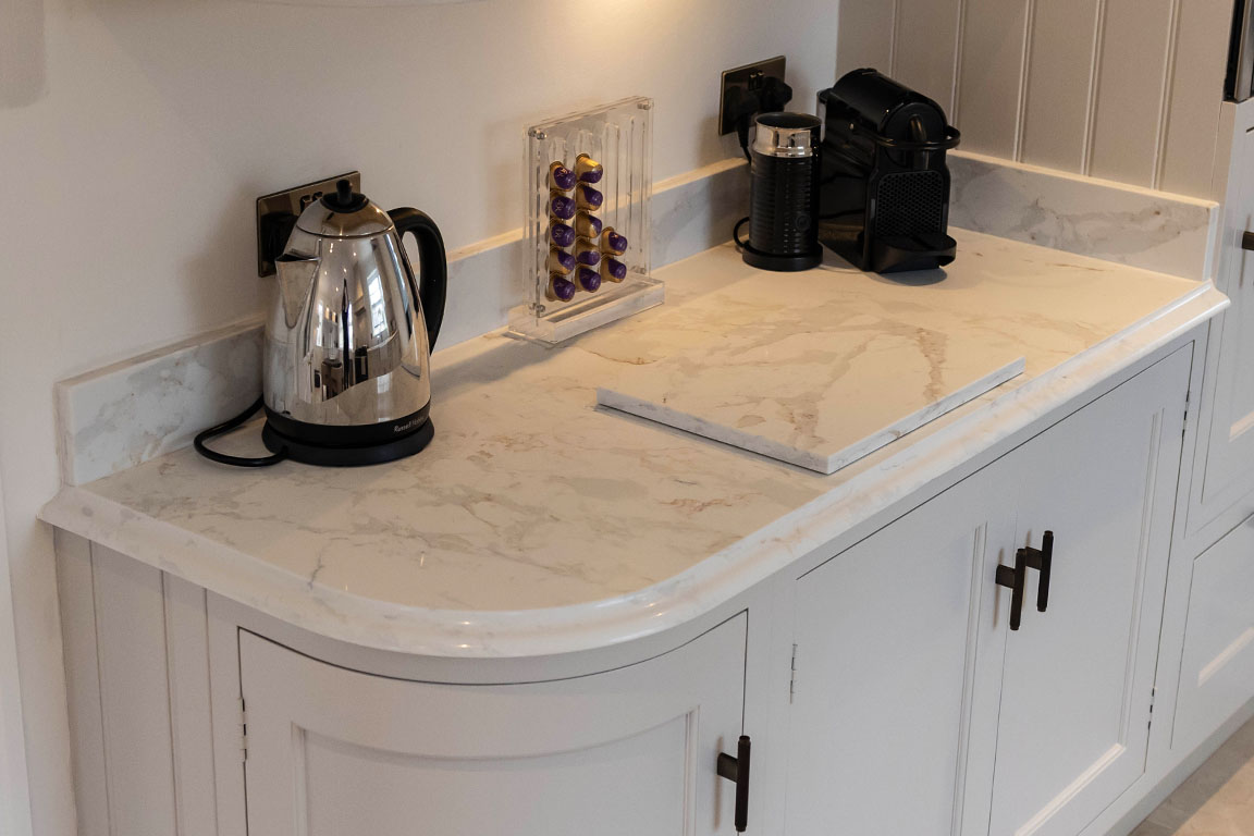
Fine scratches and dulling from years of use are more visible on dark, plain, polished quartz than on any other combination. A scratch exposes a slightly lighter line against the dark pigment, and gloss surfaces catch the light in a way that reveals wear. Light quartz with movement in the pattern, such as a marble-effect Calacatta style with veining, hides fine wear exceptionally well because the eye reads the pattern rather than the surface condition.
Chips on edges follow the same logic. A small chip on white quartz shows white material underneath and often goes unnoticed. A chip on black quartz reveals a lighter core that stands out. This is worth weighing if your kitchen sees heavy use, cast iron pans, or enthusiastic children.
4. Heat, sinks and the practical zones
Everyday living concentrates wear in specific zones: around the sink, in front of the kettle, and next to the hob.
Around the sink, hard water is the deciding factor. Limescale builds as a whitish deposit, so on light quartz it blends in, while on dark quartz the area around the tap can develop a visible pale halo without regular attention. If you live in a hard water area and want dark surfaces, budget for a daily dry-down around the sink or choose a mid-tone with pattern that disguises mineral marks.
Near the kettle and toaster, light surfaces show coffee and tea drips instantly, which some households actually prefer because spills get wiped immediately rather than discovered later. Around the hob, grease film is more visible on dark matte finishes.
None of these are reasons to avoid a colour. They are simply the maintenance rhythm you are signing up for.
5. Design longevity and resale
Kitchens are replaced roughly every 15 to 20 years in the UK, and quartz worktops will comfortably outlast fashion cycles. Light quartz, particularly whites, creams and soft marble-effect designs, has remained consistently popular for over a decade and appeals to the broadest range of buyers, which matters if you may sell within the worktop’s lifetime.
Dark quartz is more of a statement. In the right kitchen it looks exceptional, and dark surfaces paired with brass hardware and timber tones remain a strong design direction. The risk is not that dark dates faster, but that it commits the whole room to a scheme. Repainting cabinets around a white worktop is easy. Redesigning around jet black is harder.
There is a practical middle path worth knowing about: mid-tone and heavily veined quartz. Greys, greiges, and dramatic light surfaces with bold dark veining give you contrast and character while hiding daily marks better than either extreme.
Real-World Scenarios From UK Kitchens
The busy family kitchen in a semi-detached home. Two adults, three children, packed lunches made daily, homework done at the island. Here, a light veined quartz almost always wins. Crumbs and water marks vanish into the pattern, chips are less visible, and the kitchen looks presentable even mid-chaos. A polished black surface in this household would need buffing several times a day to look its best.
The open-plan extension with strong natural light. A rear extension with a roof lantern and sliding doors changes the equation entirely. Dark quartz on a large island becomes the anchor of the whole space, and the abundant light stops it feeling heavy. Owners in this scenario tend to accept the extra wiping because the visual payoff is significant.
The rental or development project. Landlords and property developers choosing quartz kitchen worktops across multiple units usually specify light or mid-tone surfaces. They photograph better in listings, appeal to more applicants and buyers, and hide tenant wear between inspections.
The low-light terrace kitchen. In a compact, north-facing kitchen, we consistently advise against dark worktops with dark units. Light quartz with light cabinetry, or light quartz balancing darker cabinets, keeps the room usable and pleasant through the darker months.
The Insight Most Guides Miss
The light versus dark debate is usually framed as a choice between two colours. In practice, three other variables matter as much as the base colour itself.
Finish changes everything. A dark quartz in a matte or suede finish behaves very differently from the same colour in high gloss. Matte hides smears and reflections but shows finger grease. Gloss shows smears but wipes to a mirror shine. Ask to handle finish samples, not just look at them.
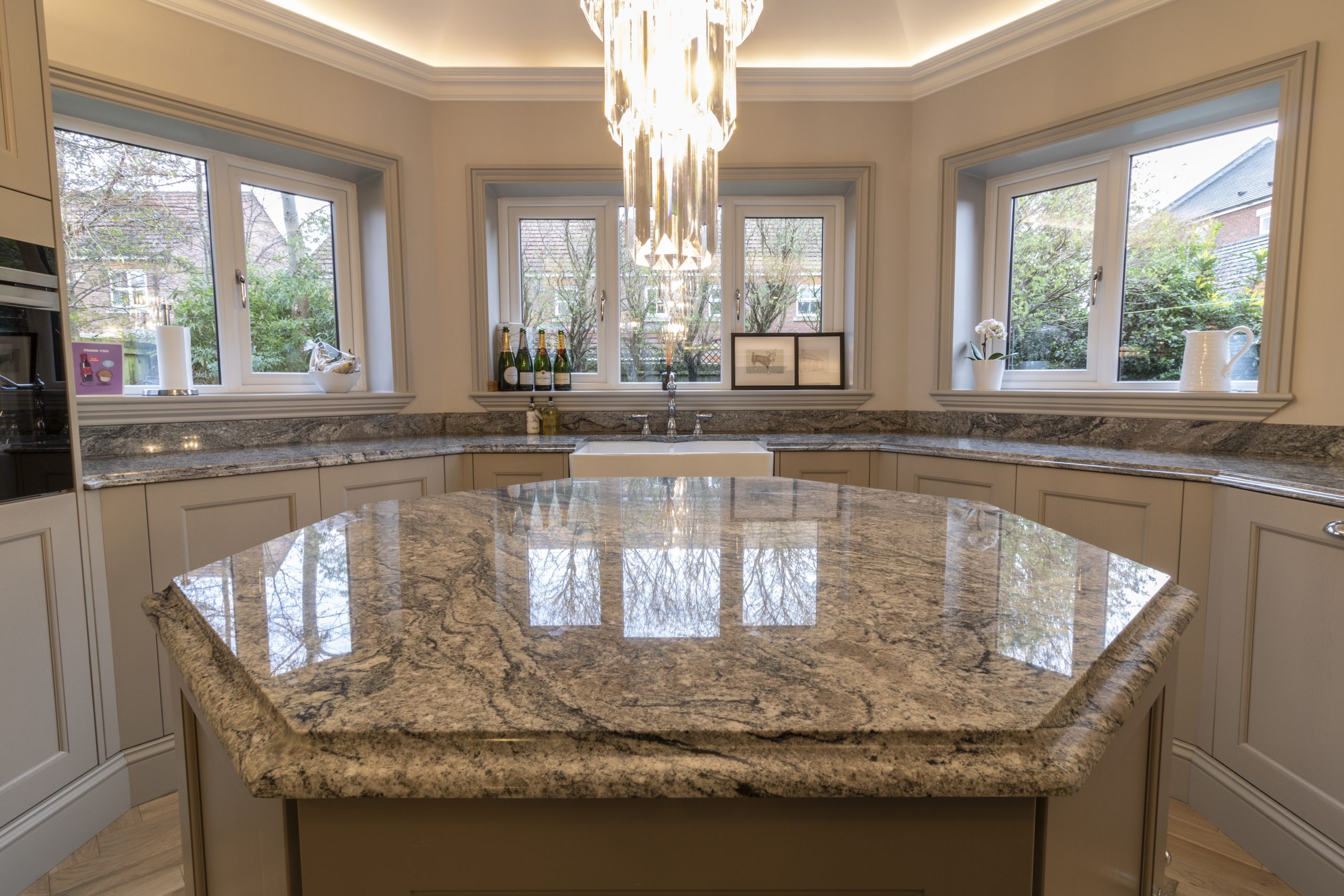
Pattern is a maintenance feature, not just a style. Veining, speckling and movement in the slab disguise crumbs, marks and wear on both light and dark bases. A plain, uniform colour in either direction is the highest-maintenance choice you can make.
The worktop does not exist in isolation. Contrast between worktop and cabinetry affects how marks read. A dark worktop on light units draws the eye to the surface, and every mark with it. Tonal schemes are more forgiving.
If you take one thing from this article, view full slabs in person and, ideally, in lighting similar to your own kitchen. A 10cm sample cannot show you how a veined pattern flows across three metres of island, and showroom lighting flatters every colour.
Making the Choice Work for Your Home
At Meridian Granite, we fabricate and install quartz worktops across Yorkshire and nationwide from our Pudsey workshop, and colour conversations are part of almost every project. Our showroom holds full slabs from brands including Silestone, Caesarstone, Cambria and Compac, which means you can stand a light and dark option side by side and see how each behaves under different light before committing.
Because we template, fabricate and install in-house, we can also advise on the details that follow the colour decision: which edge profiles suit veined slabs, where to position pattern across an island, and how sink cutouts interact with the material you have chosen. Those small decisions are where a good worktop becomes a great one.
The Verdict: Light or Dark Quartz Worktops?
For most UK households, light or mid-tone quartz is the safer everyday choice. It hides water marks, crumbs and fine wear, brightens light-starved kitchens, and holds broad appeal at resale. Choose a design with some veining or movement and it will still look clean on a busy Tuesday evening.
Dark quartz is the right choice when you have generous natural light, a tolerance for a daily buff-down, and a design vision it anchors. Done well, nothing else delivers the same depth and drama.
Neither option is wrong. The mistake is choosing on looks alone without asking how the surface will behave at 7am on a school morning. Get that question right and your quartz worktop will serve you brilliantly for decades.
Ready to compare colours properly? Visit the Meridian Granite showroom in Pudsey, Leeds to view full slabs in person, or get in touch for a free quotation on your quartz kitchen worktops.