

Quartz worktops have quietly become the deciding factor in whether a modern kitchen colour scheme works or falls flat. Most advice on kitchen colour trends focuses on cabinets and paint, then treats the worktop as an afterthought. In practice, it works the other way round. The worktop is the largest continuous surface at eye level in most kitchens, it catches more light than any cabinet door, and it is the one element you cannot repaint when a trend moves on. Get the quartz right and almost any colour palette settles into place around it. Get it wrong and even the most carefully chosen cabinetry looks slightly off.
This guide explains how quartz surfaces interact with the colour directions shaping UK kitchens right now, what actually matters when pairing stone with paint and cabinetry, and where homeowners and designers most often go wrong.
Why the Worktop Now Leads the Colour Conversation
For years, the standard renovation sequence was cabinets first, worktop second. That sequence made sense when most worktops were plain laminate or uniform black granite. It makes far less sense now.
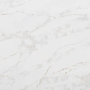
Modern quartz kitchen worktops carry genuine visual complexity. Veining, undertones, movement and finish all influence how a colour scheme reads in daylight versus artificial light. A sage green cabinet that looks perfect against a cool white quartz sample can look muddy against a warm calacatta-style slab with golden veining. The pigments have not changed. The reference surface has.
Kitchen designers working on higher-end projects increasingly reverse the process: choose the slab first, then build the palette around its undertones. It is a small change in sequence with a large effect on the finished room, and it is one of the simplest ways to avoid the mismatched, catalogue-assembled look that plagues so many renovations.
There is a practical reason too. Cabinet doors can be resprayed or replaced for a fraction of the cost of a new worktop. If one element of the kitchen should be chosen for longevity across several trend cycles, it is the stone.
The Colour Trends Defining UK Kitchens in 2026
Before pairing anything, it helps to be clear about where kitchen colour is actually heading, rather than where trend articles claim it is heading.
Warm neutrals have replaced grey. The decade of dove grey and gunmetal is over in new specifications. Taupe, mushroom, clay, oat and warm off-whites now dominate showroom displays and designer mood boards. These shades feel softer and more domestic, but they are also less forgiving. Warm neutrals expose any cool undertone in a worktop immediately.
Earthy greens have become the new safe statement. Sage, olive and deep forest green are the most requested cabinet colours in UK renovations for the third year running. Green cabinetry photographs beautifully, which sustains the trend, but it demands careful stone selection because green shifts dramatically depending on the surface beside it.
Deep, saturated darks are back, but warmer. Navy remains popular, joined by aubergine, ink and near-black bronze tones. These kitchens rely heavily on the worktop for light and contrast. Without it, a dark kitchen can feel closed in rather than dramatic.
Two-tone schemes are now the default, not the exception. A darker base run with lighter wall units, or a contrasting island, appears in the majority of contemporary kitchen design briefs. Two-tone kitchens place extra demands on the worktop because it must bridge both colours convincingly.
Choosing Quartz Worktops for Each Colour Direction
This is where most generic advice fails. Telling someone that “white quartz goes with everything” is technically true and practically useless. What matters is undertone, veining behaviour and how the surface handles light.
Warm neutral kitchens
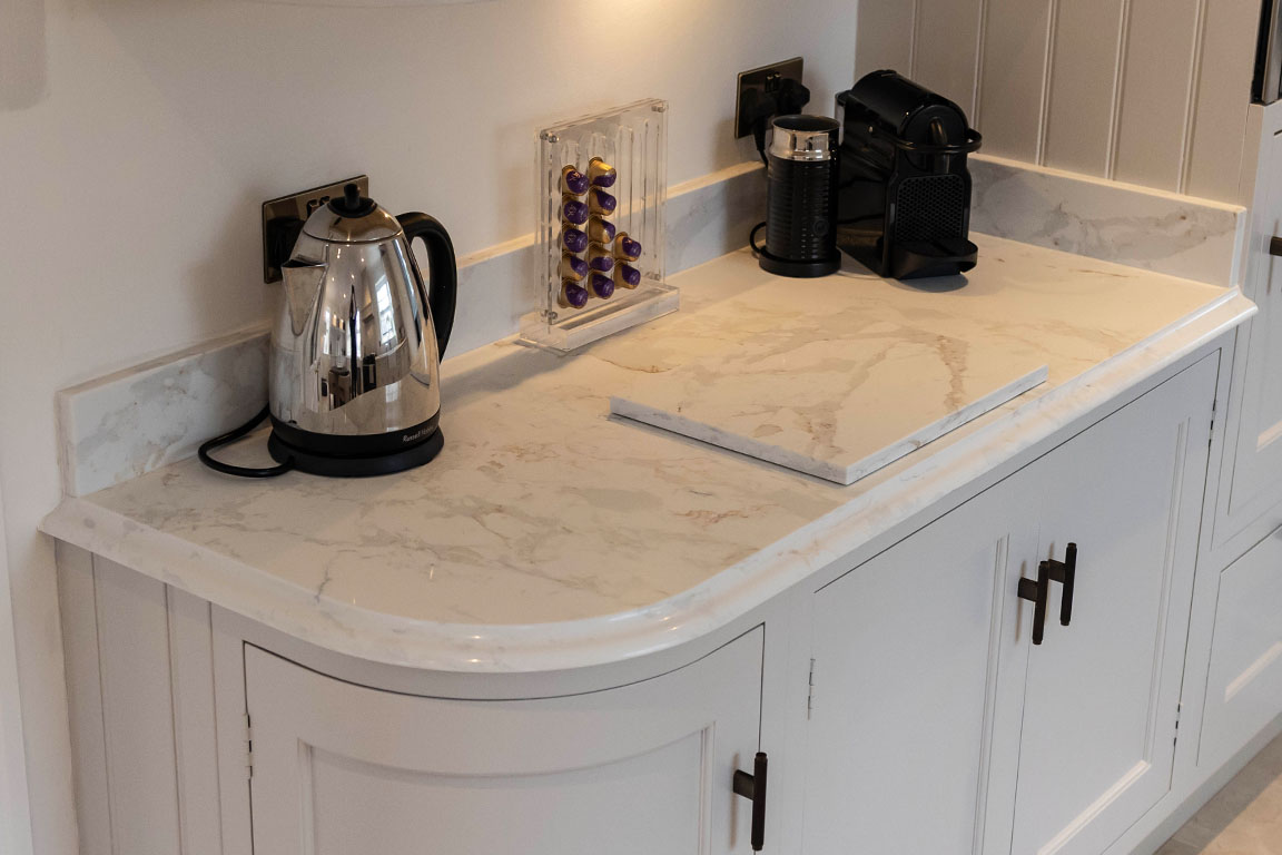
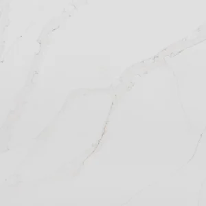
The single biggest mistake with taupe, clay and oat cabinetry is pairing it with a brilliant, blue-toned white quartz. The cool surface makes the cabinets look dirty rather than warm. Instead, look for quartz with a cream or ivory base, or a warm white with soft beige and gold veining. Calacatta quartz styles with honey-toned veining sit particularly well here, because the veining picks up the cabinet colour and ties the scheme together.
If the scheme uses brass or bronze hardware, which most warm neutral kitchens now do, a quartz with subtle warm veining echoes the metalwork and makes the whole room feel intentional.
Green kitchens
Green is the most undertone-sensitive cabinet colour there is. Sage greens with grey undertones pair well with cooler whites and soft grey-veined quartz. Olive and forest greens, which carry yellow and brown undertones, need warmth in the stone to avoid clashing.
A pattern worth knowing: deep green cabinetry with a white quartz worktop carrying fine grey and gold veining is currently the most reliable combination in contemporary UK kitchens. The gold picks up the warmth in the green, the grey keeps it grounded, and the white lifts a colour that can otherwise darken a room. Heavily patterned, dramatic slabs tend to fight green cabinetry rather than complement it. With green, restraint in the stone almost always wins.
Dark and dramatic kitchens
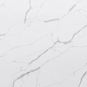
Navy, charcoal and near-black kitchens need the worktop to do two jobs at once: provide contrast and reflect light. A pale quartz with pronounced veining delivers both, and this is where bolder slabs earn their place. Strong marble-effect veining that would overwhelm a soft neutral kitchen looks superb against navy.
The alternative approach, tone-on-tone, uses a dark quartz against dark cabinetry for a monolithic look. It can be striking, but it lives or dies on lighting. In a north-facing UK kitchen with limited natural light, a dark-on-dark scheme frequently disappoints once winter arrives. This is one of the most common regrets we hear from homeowners who chose from a showroom lit very differently from their own home.
Two-tone and island-led schemes
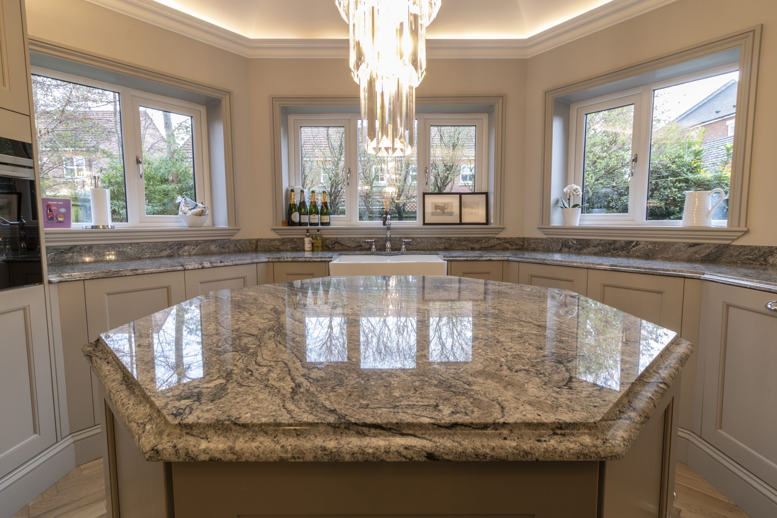
When the kitchen uses two cabinet colours, the worktop should relate to both rather than matching either exactly. A quartz whose veining contains elements of each tone, for example soft grey veining bridging white wall units and charcoal base units, unifies the design. Many designers also run a contrasting quartz on the island alone, treating it as a furniture piece. Waterfall ends, where the quartz continues down the sides of the island to the floor, remain the strongest way to make the stone the centrepiece of a two-tone kitchen.
What Actually Matters When Pairing Stone and Colour
Beyond specific trend pairings, a handful of factors determine whether a quartz worktop and colour scheme succeed together. These are the points worth checking before any order is placed.
Undertone beats shade. Two whites can differ more than a white and a grey. Always identify whether a quartz is warm, cool or neutral at its base before judging it against a cabinet colour. Hold the cabinet sample directly against the slab, not near it.
View the full slab, not a sample chip. A 100mm sample cannot show veining movement, and veining is what interacts with colour across a three-metre run. This is why a proper showroom visit matters more for quartz than almost any other kitchen material. Meridian Granite’s showroom in Pudsey holds full slabs precisely because sample chips routinely mislead on veined materials.
Test under your own light. Daylight in Yorkshire is not daylight in a showroom. Take samples home, view them at morning, midday and under your evening lighting. Warm LED lighting in particular can push a neutral quartz noticeably warmer.
Finish changes colour perception. A polished quartz reflects light and reads slightly lighter and cooler. Honed and matt finishes absorb light, deepen colour and suit the softer, contemporary schemes currently in demand. The same slab in two finishes can look like two different products.
Think about what surrounds the worktop. Splashbacks, flooring and even the view through the window all sit in the same visual frame. A quartz upstand or full-height quartz splashback in the same material simplifies the palette and is increasingly specified in modern kitchens for exactly that reason.
Real Projects, Real Decisions
Abstract advice only goes so far, so here are three situations that come up repeatedly in our work across Yorkshire and the wider UK.
The sage green rethink. A homeowner in Harrogate had committed to sage green shaker cabinetry and initially requested a stark white quartz. Against the full slab, the pairing looked clinical, closer to a dental surgery than a family kitchen. Switching to a warm white quartz with soft champagne veining transformed the scheme without changing a single cabinet. Total change to the budget: negligible. Change to the finished room: substantial.
The dark island gamble that paid off. A developer fitting out a new-build in Leeds wanted impact in a compact open-plan space. Rather than dark cabinetry throughout, we suggested light handleless units with a single island in deep blue, topped with a dramatically veined white quartz with waterfall ends. The island became the focal point, the room stayed bright, and the show home sold on the strength of the kitchen photography.
The north-facing correction. A couple renovating a 1930s semi had chosen a mid-grey quartz online for their charcoal kitchen. When samples were viewed in their north-facing room, the combination flattened into a single gloomy mass. A pale quartz with warm grey veining restored the contrast the scheme needed. This is the value of insisting on home viewing before fabrication, and it is a step no reputable fabricator should let a customer skip.
Why Quartz Suits Colour-Led Design Better Than Most Surfaces
It is worth being direct about why quartz, specifically, has become the default surface for colour-driven modern kitchens.
Because quartz is engineered, its colour and veining are consistent and repeatable in a way natural stone cannot guarantee. When a designer builds a palette around a specific undertone, quartz delivers that undertone across every section of the worktop, including cut-outs, upstands and islands. Natural granite and quartzite offer beauty that engineered stone cannot fully replicate, but they introduce variation that colour-sensitive schemes may not tolerate.
Quartz also offers the widest colour range of any premium worktop material, from pure whites through concrete-effect greys to deep charcoals and marble-style statements. Brands such as Silestone, Caesarstone, Cambria and Compac release new colours in step with interior trends, which is why quartz collections track kitchen colour movements more closely than any natural material can.
Practically, quartz is non-porous, stain-resistant and needs no sealing, which matters more than it sounds in pale, warm-toned kitchens where a stained worktop would be immediately visible.
Bringing It Together
Modern kitchen colour trends are moving warmer, greener and more saturated, and every one of those directions makes the worktop choice more consequential, not less. The reliable approach is straightforward: identify the undertone of your cabinet colour, choose quartz that shares or deliberately balances that undertone, view full slabs rather than chips, and test everything in your own light before committing.
Bespoke quartz worktops reward this care. Fabricated and installed properly, they will outlast at least two repaints of the cabinetry around them, which is exactly why the stone deserves to lead the decision rather than follow it.
Meridian Granite fabricates and installs quartz worktops from our workshop and showroom in Pudsey, Leeds, supplying homeowners, designers and developers across Yorkshire and nationwide. Full slabs from Silestone, Caesarstone, Cambria, Compac and other leading brands are on display, and our team handles everything from laser templating to installation in-house. If you are planning a kitchen around one of these colour directions, visit the showroom or get in touch to view slabs against your cabinet samples before you commit.